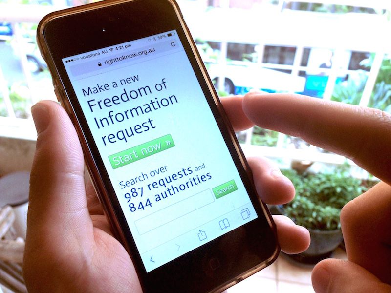
One in four people who visit Right To Know use a mobile device to do so. Unfortunately the site hasn’t been designed for them. They’ve been forced to zoom in on the page designed for desktop users. This made it hard to navigate, quickly understand what a page is about, and request information.
When traffic peaks on the site—when a news article links to a request for example—almost half the visitors are on phones. These high traffic requests are often important ones, so it’s a big problem that people aren’t using a site designed for their device.
Yesterday we deployed a new version of Right To Know that changes layout to suit your device. We’ve tried to keep everything as familiar as possible in this initial step. If you’re on a desktop, laptop or large tablet you shouldn’t notice any difference—but, if you’re visiting Right To Know on your phone, you should see a big difference! You can quickly move between tasks on the site using navigation designed for touch screens, clearly see page headings and sections, and read requests at a comfortable text size. We hope this is a big improvement. If you’re on your phone now you can see for yourself!
Providing a better experience for people on phones is an important part of making the information in Right To Know more accessible. For many people a smart phone is their only way to access the web.
There are still bugs and places where the site is still hard to use on a phone. You can help make Right To Know better by making reports via email to contact@righttoknow.org.au or directly into our issue tracker.
